On Technical Analysis, Fractals, and Stock Prices
I’ve been thinking recently about fractal geometry with applications to finance, and I talked to an acquaintance who informed me that he watches the “fractals” on his charts when trading. This prompted me to do some research into how technical analysts use “fractals” and see what kind of information such an indicator provides. There are many issues with using fractal behavior as a technical indicator, namely that the way the term is used in technical analysis doesn’t sound like it has anything to do with fractals at all. According to Investopedia, in technical analysis a fractal is defined as
A type of pattern used in technical analysis to predict a reversal in the current trend. A fractal pattern consists of five bars and is identified when the price meets the following characteristics: >1. A shift from a downtrend to an uptrend occurs when the lowest bar is located in the middle of the pattern and two bars with successively higher lows are positioned around it. >1. A shift from an uptrend to a downtrend occurs when the highest bar is located in the middle of the pattern and two bars with successively lower highs are positioned around it.
In other words, a fractal in the technical analysis community is just a pattern where there is a localized minimum or maximum in 5 contiguous time steps of the price series. I think somebody just decided to call it a fractal because it sounds cool and scientific.
Now considering the fact that price action moves around all the time, there is no way that this fractal construct of technical analysis provides any useful information. Fractals in this sense simply cannot be useful because such phenomena will occur all the time. So if these fractals in technical analysis aren’t real, what about the real ones? The answer is that a fractal is just something in which all parts resemble the whole. No matter how much you zoom in or how much you zoom out everything stays more or less the same.
The classic example of fractal patterns are shorelines. The view from space is similar to the view from an aircraft which is similar to the view from a lower-flying glider, and so on. Another familiar example is fauna. A tree has a trunk with branches, and each branch has its own branches. In other words, every branch from a tree is like a miniature tree itself. This kind of behavior is also seen in financial markets. Without any scale on the chart, it is impossible to know what period of time the chart represents. Below are two charts for IBM closing prices without any scales. The filename for the image says which one is which. Can you tell the time period covered by either chart?
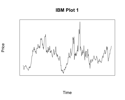
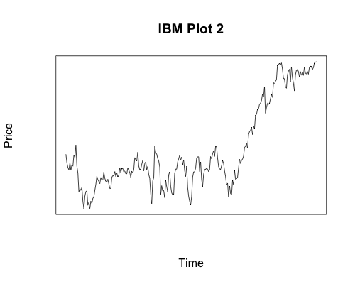
Here is the R code for the plots above, which contain the dates. Even knowing the two dates involved it would be impossible for you to tell which is which had I not included plot titles.
ibm10year = getYahooData("IBM", 19800101, 20100101, adjust=FALSE, freq="monthly", type="price")

plot(seq(1:length(ibm10year$Close)), as.data.frame(ibm10year$Close)$Close, main="IBM Plot 1", axes=FALSE, type='l', frame.plot=TRUE, xlab="Time", ylab="Price")

ibmshort = getYahooData("IBM", 20100101, 20110101, freq="daily", type='price')

plot(seq(1:length(ibmshort$Close)), as.data.frame(ibmshort$Close)$Close, main="IBM Plot 2", axes=FALSE, type='l', frame.plot=TRUE, xlab="Time", ylab="Price")
Now lets apply this correct concept of a fractal, or object that is self-similar on all scales, to financial instruments. One way that fractals are measured or categorized is by their Hurst exponent $H$. It is a description of the long-term memory of a time series, so if $0 < H < 0.5$ you can conclude that the series has negative autocorrelation. This means that a decrease will typically be followed by an increase. This is equivalent to a mean-reversion pattern.
If $0.5 < H < 1$ you can say that there is a positive autocorrelation, which indicates that an increase will be followed by an increase and similarly for decreases. This would be a trend-following pattern.
Finally, if $H = 0.5$ then the series is completely random, meaning that a stock is equally likely to go up or down regardless of what happened the instant prior.
Lets look at a few different data sets to determine their corresponding Hurst Exponents. We will start off with an example of a random sequence of 8000 numbers, normally distributed, so that we can see what we expect from random fractal behavior.
rm(list = ls(all = TRUE))
randseq = cumsum(rnorm(8000))
N = length(randseq)
randreturn = randseq[2:N]/randseq[1:(N-1)]-1
plot(hurstSpec(randreturn, method="standard", sdf.method="multitaper"))
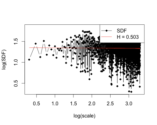
In this case you see a Hurst Exponent H = 0.503, which is what we expect since we generated the sequence randomly and H = 0.5 corresponds to random behavior. Now let’s look at a plot for IBM from 01/01/1980 to last Friday, 6/3/2011, that’s over 31 years of returns.
rm(list = ls(all = TRUE))
ibm80 = getReturns("IBM", freq="day", start="1980-01-01", end="2011-06-03")
plot(hurstSpec(ibm80$R, method="standard", sdf.method="multitaper"))
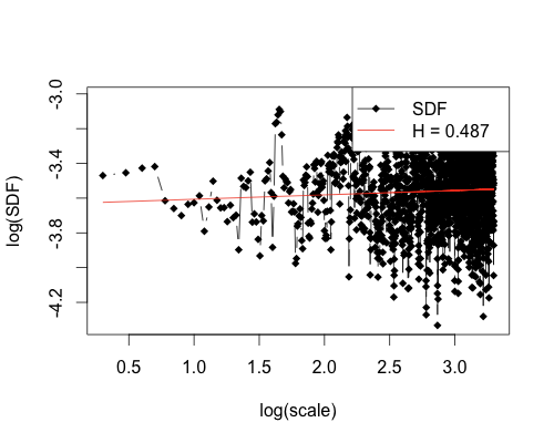
Here we have a Hurst Exponent of H = 0.487, which again points to price fluctuations being random. So on a scale of just over 31 years, there cannot be any reliable trading indicator. This fact does not bode well for technical analysis. Perhaps it is a scale issue and smaller time periods will reveal more patterns, you say? Well, fractals by definition are self-similar and so time scales are irrelevant.
However, I know people will not be convinced on theory alone so here is a plot of IBM from 01/01/2006 to last Friday, 06/03/2011, just over 5 years of data.
rm(list = ls(all = TRUE))
ibm06 = getReturns("IBM", freq="day", start="2006-01-01", end="2011-06-03")
plot(hurstSpec(ibm06$R, method="standard", sdf.method="multitaper"))
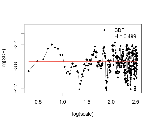
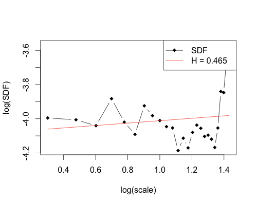
This gives a Hurst Exponent of H = 0.499, which is actually closer to pure randomness then the deliberately random sequence we constructed earlier. Even starting from 01/01/11, the Hurst Exponent is still 0.465, very close to 0.5. Having the same Hurst Exponent at all time scales is precisely what is expected from something that is fractal in nature.
rm(list = ls(all = TRUE))
ibm06 = getReturns("IBM", freq="day", start="2011-01-01", end="2011-06-03")
plot(hurstSpec(ibm06$R, method="standard", sdf.method="multitaper"))
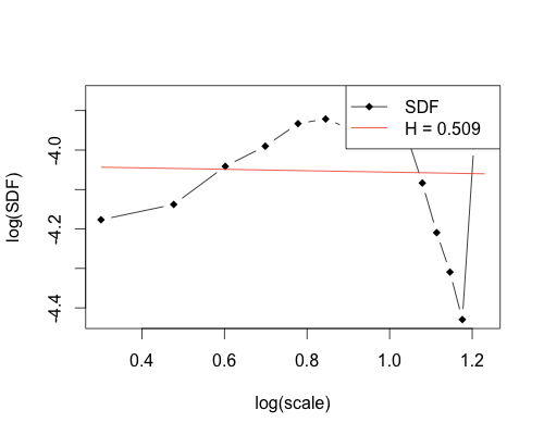
If we go down to behavior over the last three months, from 03/01/11-06/03/11, the result is similar with a Hurst Exponent of 0.509. Again, this shows almost perfect randomness.
rm(list = ls(all = TRUE))
ibm06 = getReturns("IBM", freq="day", start="2011-03-01", end="2011-06-03")
plot(hurstSpec(ibm06$R, method="standard", sdf.method="multitaper"))
As you can see, the true definition of fractal does hold when considering stock prices. The Hurst Exponent, a measure of how movements in a fractal pattern are related to each other stays relatively constant and very close to 0.5, which indicates that there is no discernible pattern in the data. We have shown that no predictability exists for our example, IBM, in ranges from 31 years down to 3 months.
As you can imagine, since the price movement is fractal in nature, we can zoom in as much as we like and the results will be the same. Finally, the 5 steps in a time series that form a fractal in technical analysis provide no usable information since there is no possible way to predict with accuracy when prices will move and what direction they will move in. If you’re trading based on technical analysis indicators such as these, you may want to reconsider your strategy.
